Pop Color - Paint by number
- 4.8
- Rating
- 1.00M
- Installs
- Free
- Price
 Analysis by App-foxy
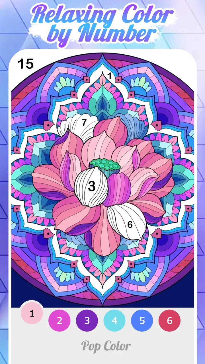
I opened Pop Color expecting a simple color-by-number pastime, and that is exactly where its appeal begins. It does not ask me to learn a complicated rule set or compete against another player. Instead, it turns small matching decisions into a quiet board-game-like routine: find the right numbered area, choose the matching color, and gradually watch the picture become complete. The experience is easy to understand within moments, but it still gives each session a satisfying sense of progress.
That simplicity makes it a useful choice for short breaks. I can play when I want something more engaging than scrolling but less demanding than a strategy game. The board category is a good fit because the pleasure comes from careful observation and orderly completion rather than speed or reflexes. At the same time, anyone looking for deep tactical choices, a story-driven setting, or competitive play should know that this is deliberately a gentle experience.
The game is free to download, suitable for Everyone, and comes from LoveColoring Game. It has reached over a million installs and holds a 4.8 average from around 32 thousand ratings, which suggests that its relaxed format has found a broad audience. It launched on December 4, 2023, and version 2.1.3 supports devices running Android 7.0 or later. Optional purchases range from $0.99 to $49.99 per item, so I would approach it as a free starting point with optional spending rather than assume every part of the experience is permanently cost-free.
You May Also Like

 Blood Strike: 2.5 Anniversary
Blood Strike’s Loadouts Turn Every Drop Into a Tactical Gamble
A close look at Blood Strike’s custom loadouts: how fast access to signature weapons reshapes its battle royale rhythm, rewards preparation, and narrows the gap between fights.

 Pandora - Music & Podcasts
Pandora’s Music Is Easy to Start, but Harder to Recover
Pandora’s strength is its low-effort path from a seed to a station. Its weak spot is how much confidence it asks you to place in connection, setup, and quiet recovery.

 8 Ball Pool
 Is Built on Rivalries, Rematches, and Routine
A close look at the rivalries, rematches, shared routines, and unanswered safety questions that turn a quick pool match into a persistent mobile community.

 Samsung Music
’s Quiet Strength Is Playing What You Already Own
Its reach comes less from spectacle than from dependable access to a personal library. That simplicity is both the app’s strongest retention engine and its ceiling.

 AccuWeather: Weather Radar
AccuWeather Review: A Quick, Clear Forecast for Everyday Decisions
For everyday plans, the best forecast is the one you can understand quickly. AccuWeather makes rain timing, radar, and local conditions easy to act on, with a few trade-offs.

 Hill Climb Racing
Why Hill Climb Racing Still Turns Crashes Into One More Run
A tiny car, a bumpy hill and one more upgrade: Hill Climb Racing keeps resurfacing because its simple chaos makes every near-miss feel personal.
More From Our News Desk



How Pop Color Builds Its Calm World
I find that the calm in Pop Color comes less from escaping into a detailed world and more from choosing how to approach each unfinished picture. In this section, I’ll look at how its visual rhythm, small decisions, and unhurried pace work together, including where that quiet style may start to feel limiting.
A first impression built around small victories
The strongest part of my first session was how quickly the game established a comfortable loop. A picture begins as a collection of unfinished spaces, and every correct selection removes a little visual uncertainty. That creates a series of small victories instead of one distant reward. I never felt that I needed to understand the whole image before beginning; filling one area naturally made the next area easier to notice.
This structure is especially friendly to people who do not usually play games. There is no intimidating opening lesson to memorize, and the basic objective is visible in the artwork itself. A child can understand the matching idea, while an adult can use the same process as a brief mental reset. The Everyone rating reinforces that broad accessibility, although younger players may still benefit from an adult explaining any purchase prompts before they start.
What I appreciate is that the game does not confuse relaxation with a total lack of interaction. I still have to inspect the board, identify the relevant number, and decide where to work next. The decisions are modest, but they keep the activity from becoming a passive animation. That balance is important: the game gives my attention somewhere to rest without demanding the concentration of a traditional puzzle board.
Color as the main visual language
The art direction communicates through completion. Uncolored sections create a sense of unfinished structure, while filled areas provide immediate feedback. Rather than relying on a complicated fictional setting, the game lets the image itself become the setting. This makes the mood coherent: the board is both the puzzle and the visual reward.
That approach also explains why the game works well in short sessions. I do not need to remember a plot, a character build, or a collection of objectives from a previous visit. I can return after a day away and understand the board immediately. The visual language is self-contained, which is a strength for casual use but also a limitation for players who need narrative context to stay interested.
My practical advice is to avoid treating every picture as a race to completion. I found the experience more pleasant when I alternated between obvious large areas and smaller details. Filling only the easiest spaces can make the remaining board feel cluttered, while moving occasionally toward a difficult corner gives the image a clearer shape sooner. This is a small change in approach, but it makes the progression feel less repetitive.
Why the setting feels peaceful without becoming empty
The game’s setting is not built from dialogue or exploration. Its sense of place comes from the gradual transformation of the artwork. A blank or partially completed picture gives me a quiet visual task, and the finished result acts as a soft endpoint. That is enough to create a mood because the game keeps its presentation focused on the act of coloring.
There is a useful trade-off here. The restrained presentation avoids distractions, making it suitable for winding down before bed or taking a pause during a busy day. However, players who enjoy dramatic environments, character reactions, or changing scenery may find the world too static. The calm atmosphere is intentional, but it will not satisfy someone who wants the setting to evolve like it would in an adventure or role-playing game.
Sound and the rhythm of a session
Pop Color’s rhythm comes primarily from repeated visual actions rather than fast challenges. Each selection has the potential to create a tiny moment of confirmation, and those moments form a steady pace. I can work quickly through obvious sections or slow down when the board becomes more detailed. The game therefore fits different moods without forcing me into a fixed tempo.
I would describe the sound design as something to evaluate alongside the visual loop rather than as the main attraction. This is not a game I would choose for a dramatic soundtrack or memorable audio performances. Its identity depends more on the quiet cadence of selecting, filling, and observing progress. For me, that makes it easy to use while listening to something else, provided the surrounding environment and device settings make that comfortable.
That flexibility creates one of the more useful everyday scenarios. After a long workday, I might spend a few minutes completing a picture while listening to a podcast. The game gives my hands a simple task, but it does not require the sustained audio attention of a rhythm game or the constant reading of a story game. On another day, I can focus only on the artwork and let the slower pace do the work of helping me settle down.
The trade-off is that the same rhythm can eventually feel repetitive. If I play for a long stretch, the basic action may lose some of its freshness because the reward is incremental rather than surprising. I would use it in compact sessions, especially when the goal is relaxation. Players who prefer escalating tension may want to alternate it with a more active game instead of expecting the coloring loop to carry a long uninterrupted evening.
Where the mechanics fit the mood
The core mechanic is a natural match for the game’s atmosphere because the action and the reward point in the same direction. I am not asked to destroy, outrun, or outscore anything. I am asked to make a picture more complete. That removes the conflict found in some casual games, where a supposedly relaxing theme is paired with timers, pressure, or demanding precision.
At the same time, the low-pressure design means that the game’s challenge is limited. The satisfaction comes from attention and completion, not from mastering a complex system. If I want to exercise planning, memory, or competitive decision-making, a traditional board game will offer more depth. If I want a calm visual activity with just enough interaction to keep me involved, this is where Pop Color makes more sense.
One useful habit is to treat the numbered spaces as a scanning exercise. Instead of tapping randomly, I look for clusters belonging to the same color and complete them in a loose route. This reduces the feeling of searching across the entire picture and lets the board reveal itself in stages. It is not a separate game mode, but it changes how efficiently and comfortably I move through a design.
Another practical consideration is screen size. On a larger phone or tablet, small areas should be easier to inspect, while a compact display may make detailed sections more tiring. I would choose a comfortable brightness level and avoid playing with the screen too dim if the artwork contains many small spaces. These choices matter because the game’s challenge is visual attention; eye strain can turn a relaxing session into an unpleasant one.
Free access and the question of spending
The free entry point is important because it lets me test whether this particular style of relaxation suits me before spending anything. The optional purchase range is broad, from less than a dollar to amounts approaching fifty dollars per item. I would therefore decide on a personal limit before browsing extras, especially if a child is using the device.
This purchase structure may be comfortable for someone who wants to support a game they use regularly, but it can feel less appealing to a player who expects a single upfront purchase with everything included. The right choice depends on how often the game becomes part of your routine. Occasional players can simply enjoy the free starting experience, while frequent users should pay attention to what an optional item adds before buying.
I also would not judge the game by its large install base alone. More than a million installs show that it is easy to discover, but popularity does not guarantee that its slow pace will suit every person. The high average rating is encouraging, yet the most relevant question is personal: do you enjoy gradual visual completion, or do you need stronger goals and more varied mechanics?
Who will enjoy it, and who should skip it?
I would recommend Pop Color to people who like coloring activities, visual organization, and games that can be paused without penalty. It is a particularly good match for someone who wants a gentle evening routine, a distraction during a short waiting period, or a simple activity that does not require learning a large ruleset. Families may also appreciate the approachable premise, while still keeping purchase controls in mind.
I would be more cautious about recommending it to players who want multiplayer interaction, strategic depth, a campaign, or a strong narrative world. It is also not the best choice if you need a high-energy game to stay alert. The board format gives it a clear identity, but it does not turn the coloring process into a complex puzzle contest. People who become frustrated by repeated visual searching may prefer a more structured logic game with explicit moves and measurable difficulty.
Compared with ordinary coloring books, the digital format offers immediate guidance through numbered areas and removes the need to prepare physical materials. Compared with traditional board games, it is far more solitary and less strategic, but also much easier to start and stop. Compared with fast casual games, it replaces reflexes and failure states with steady completion. That makes it a companion activity rather than a substitute for every kind of game.
What I would check before making it a daily habit
Before committing to regular use, I would first try several sessions at different times of day. A game that feels soothing for ten minutes may feel monotonous after a longer stretch. I would also check whether the current version behaves comfortably on my device, since version 2.1.3 requires Android 7.0 or later. That requirement covers many older devices, but not every phone still in use.
I would then decide whether the visual loop gives me enough variety. The game’s value depends on enjoying the individual pictures and the process of completing them. If I find myself tapping mechanically without noticing the artwork, the experience may have become background activity rather than meaningful relaxation. In that case, switching between this and a more varied puzzle would be a better routine than forcing daily use.
Finally, I would treat purchases as optional enhancements to consider carefully, not as part of the basic reason to install the game. The free beginning is enough to reveal whether I like the mood, pacing, and board interaction. That trial is more useful than assuming a high rating or a large install count can predict my own response.
My atmosphere verdict
Pop Color succeeds because its art direction, pacing, and mechanics agree with one another. The unfinished image gives me a clear visual task, the gradual coloring supplies a steady rhythm, and the lack of competitive pressure protects the calm mood. I never felt that the game was pretending to be something more ambitious than it is. Its modest goal is also its clearest strength.
My main reservation is repetition. The same gentle loop that makes the game accessible can limit its appeal during long sessions, and the broad optional purchase range means careful spending is sensible. Still, those concerns do not undermine the basic experience for the right audience. I see it as a focused relaxation game, not a replacement for a deep board game or a story-rich adventure.
My recommendation is simple: choose Pop Color if you want a quiet, visual activity that rewards patience and small progress. I would keep it on my phone for short breaks, decompression after work, or moments when I want to occupy my hands without filling my head with pressure. If that sounds more appealing than competition, complex strategy, or constant action, LoveColoring Game’s board game is worth trying for free.
FAQs for Pop Color - Paint by number
01What is Pop Color - Paint by Number?
Pop Color - Paint by Number is a creative and relaxing app that allows users to paint a variety of intricate designs using a simple number-based color system. It's perfect for those looking to unwind and express their creativity without needing advanced artistic skills.
02How does the number-based coloring system work?
In Pop Color, each design is divided into sections labeled with numbers. Each number corresponds to a specific color. Users simply select a color and fill in the matching numbered areas, making it easy to create beautiful artworks without confusion.
03Is Pop Color suitable for all ages?
Yes, Pop Color is designed to be user-friendly for all ages. Its intuitive interface and simple mechanics make it accessible for children, while its intricate designs provide a satisfying challenge for adults, making it a versatile app for family enjoyment.
04Does Pop Color offer a variety of designs?
Absolutely! Pop Color boasts a wide range of designs, from simple shapes to complex scenes. The app regularly updates its library with new patterns, ensuring users always have fresh content to explore and enjoy. This keeps the experience engaging over time.
05Are there any in-app purchases or ads?
Pop Color is free to download, but it includes optional in-app purchases for premium features and ad-free experiences. While ads are present in the free version, they are generally non-intrusive. Users can choose to upgrade for a more seamless painting experience.
Pros
- Intuitive interface with easy navigation.
- Wide variety of coloring pages available.
- Relaxing music enhances the experience.
- Offline mode available for coloring anytime.
- Regular updates with new designs.
Cons
- In-app ads can be intrusive.
- Limited free designs without subscription.
- Some colors are hard to distinguish.
- Requires significant storage space.
- Occasional lag on older devices.

Pop Color - Paint by number
Gallery